Making the purchase process enjoyable again.
Founded by Abey Onalaja and Mark Wickstead, Ruffle is powered by a dedicated team of technologists, product specialists, and commerce enthusiasts. Together, we pool our expertise to craft a marketplace that balances the interests of both buyers and sellers.

Read time: 6 mins
The challenge
Every great experience starts with an idea. Our goal was to make ticket purchasing seamless and enjoyable. Currently, glitches make the process frustrating, taking away from the experience.
Research Choices


User Research
I conducted usability testing to gain valuable insights into users' real-world behaviours and how they influence their interactions with the product. This included 1-2 in-depth user tests. I also carried out a test to see how the app functioned from my prospective.
Reviewing the process
I conducted a thorough review of the Ruffle app's process and identified critical issues impacting its functionality. Specifically, the app crashed multiple times during the review process, and the "plus" functionality consistently reset to zero, disrupting the intended user flow.
-
Straight to the point but had very few options for to select from
-
The design layout becomes confusing from here. two of the same image is not needed at different sizes
-
The question is asked but can easily be by passed with the wrong the answer.
-
When pressing the Plus button, a -1 appears, which is a clear error and can be quite frustrating.

(For transparency, the user requested not to share the video but gave consent for a screenshot to be used instead)
Usability Test
I conducted a usability test to gather insights into how users interacted with the process. To benchmark and evaluate the experience, I compared the current Ruffle website app with ITV/Win, which features a similar competition entry flow. This comparison allowed me to identify key usability patterns and areas for improvement.
Pain points
Quoted from Tina
“Doesn't really look like a competition website. none of the images really stand out.
Quote From Sherelle
“what’s the point of the question?"Also, it’s not allowing me to move forward! I did everything right. That’s confusing?”
Quote Other users
Not very eye catching, it doesn't grab you. Very bland
The Goal
Make it work
The process functions well, but the inability to navigate to the main screen is a significant issue.
Update the look
The design lacks the appearance of a raffle website and requires an update.
Make it Fun
Every ticket is a chance to win big! 🎉 When users buy one, we spark their excitement by showing how each ticket boosts their odds. With fun, strategic messaging and engaging prompts, we turn every purchase into a thrilling opportunity they won’t want to miss!
Sketch The interaction
I carefully designed the booking process and add-on screens, ensuring an optimal user experience by focusing on every detail. Using a comprehensive customer journey map, I pinpointed key pain points and challenges, enabling me to streamline and refine the flow with clarity and purpose. This user-centered approach ensured intuitive, seamless interactions that align perfectly with the needs and expectations of our users.
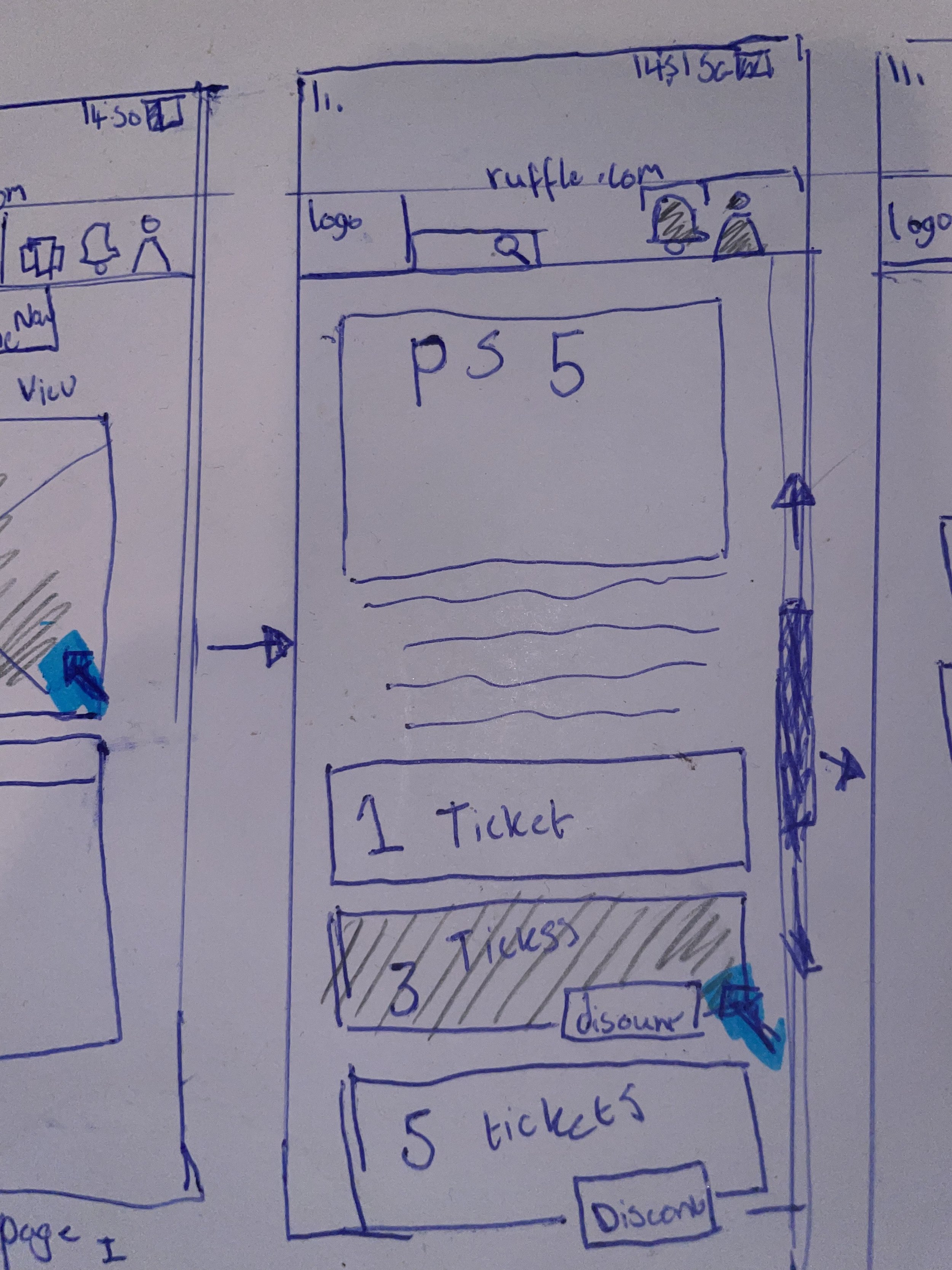
The second page will contain the visual image of the prize as well as the information, terms of the spec and any other information the user will need. How long the prize is open for, how many tickets have been bought.
Page two will include
Sign-in
Register
Terms & conditions
ticket options
terms & conditions
extra ticket options.
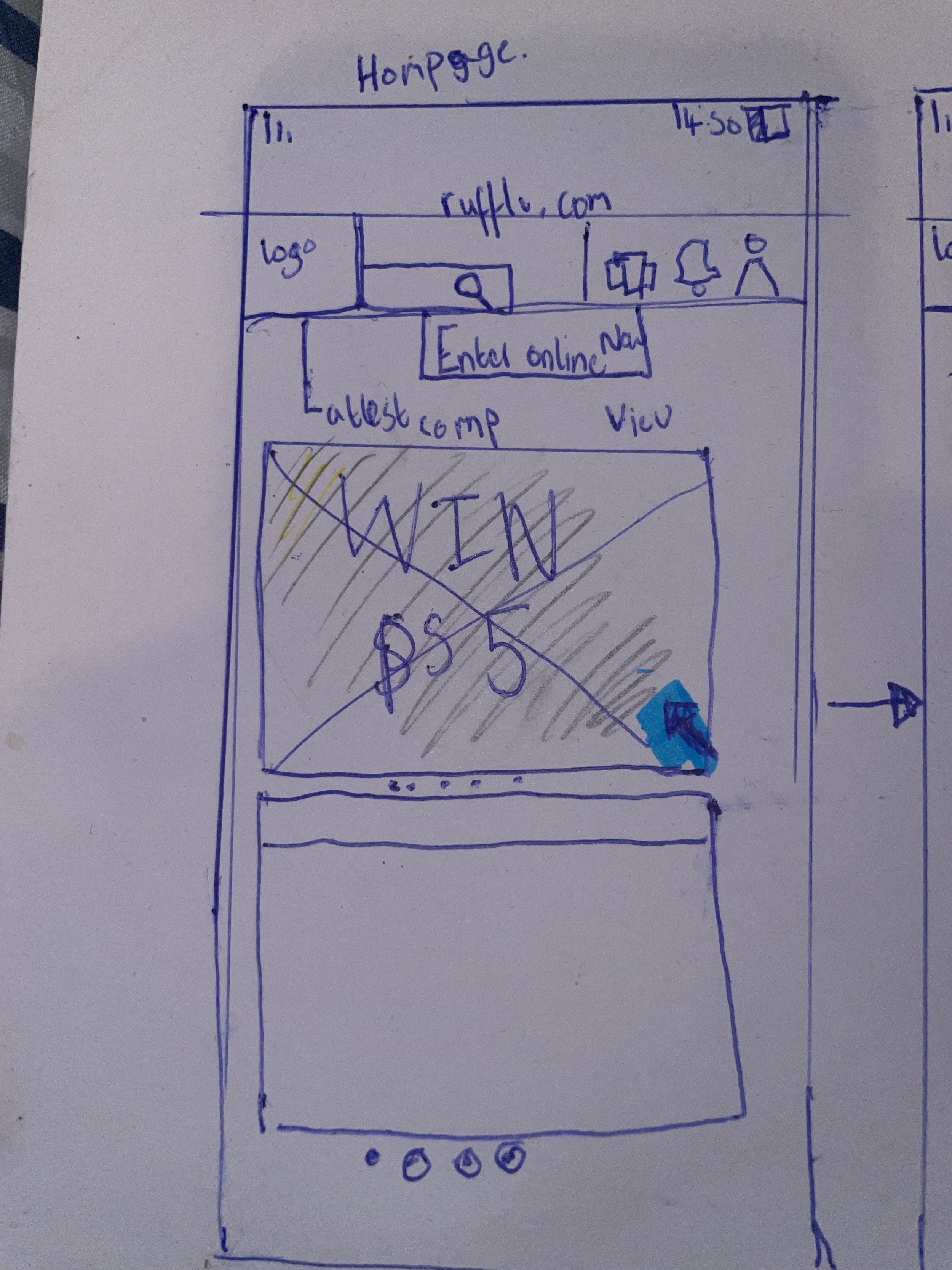
The home Screen will have all of the competitions that we offer scrolling down the page. It will also have a notification and sign in option on the Local nav,
Home screen tabs will include
sign-in
register
Terms & conditions
Create your own competition.
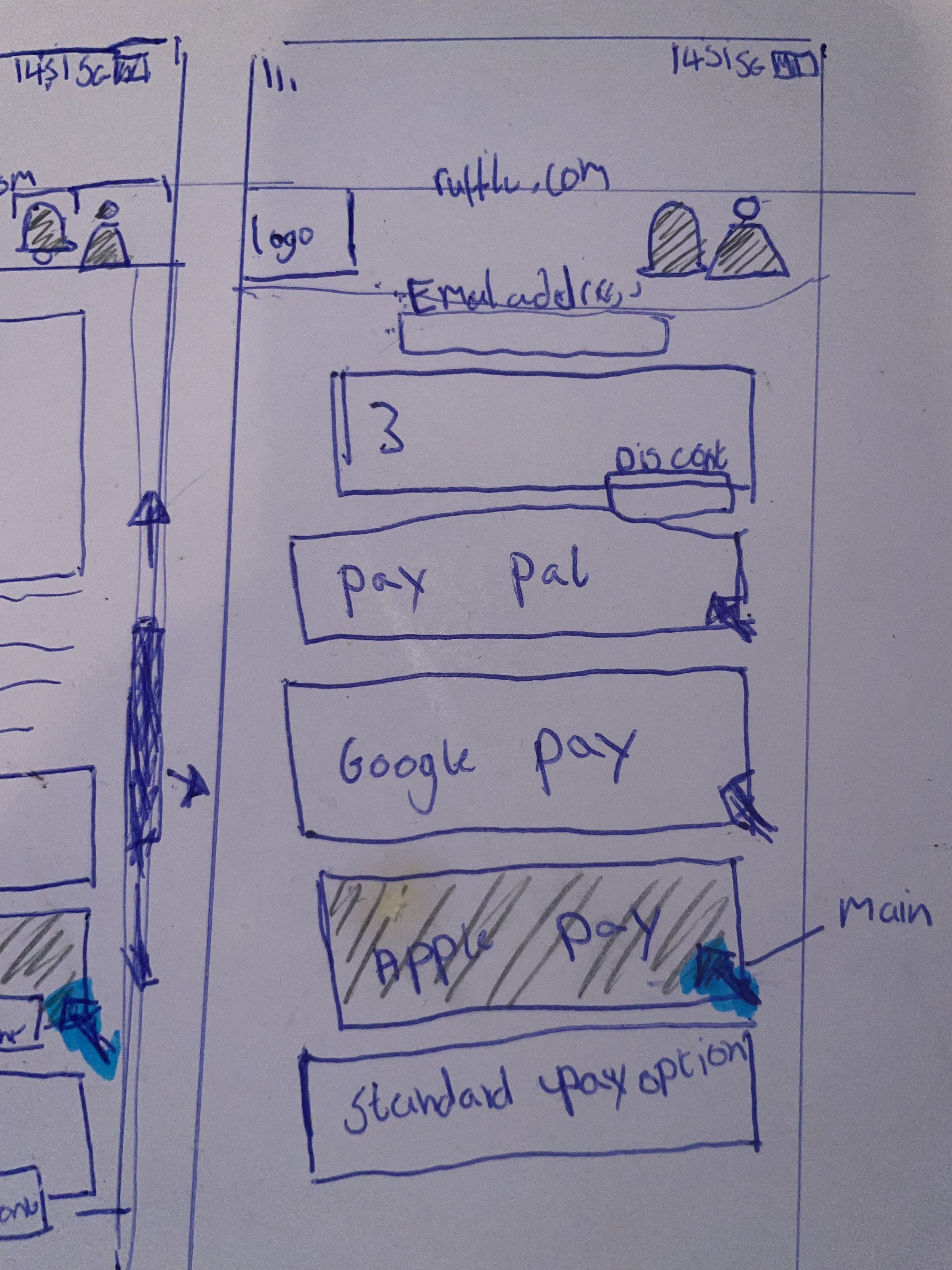
This page will be the checkout page. Where you will have all of the pay options. There will be a continue button at the bottom of the page but this will be in grey. Page 3 will include
apple pay
Goole pay
Pay pal
pay by bank

Before:
Inconsistent Aesthetics: Users were unsure if the design matched the Raffle website.
Confusing Ticket Purchase Process: Led to uncertainty and hesitation.

After:
Consistent Aesthetics: Aligns with the Raffle website for a cohesive experience.
Clear Visual Cues: Enhance intuitiveness and transparency.
Improved Ticket Purchase Process: Reduces confusion and boosts user confidence.
